
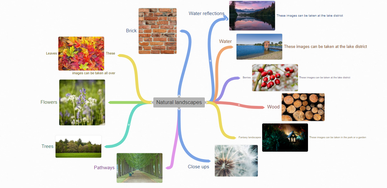
Statement of intent
My chosen theme for my GCSE photography exam is landscapes.
I have chosen to study this theme because I find it really interesting and I can take so many different pictures to make my work unique and stand out, it also helps me to be able to explore and visit new places that I haven't been to before.
I am going to do a lot of different landscapes such as trees, waters, flowers, urban and my own local landscapes. I have chosen to do this because its gives a wide variety of creativity and techniques, its an area where I can go out to explore many themes and I can think outside the box and push myself out of my comfort zone.
In order to produce a successful, creative end product I need to do some in depth research around my chosen theme. I will create a coggle mind map to see what I actually want to take pictures of. Also I will go on the internet and do research into famous landscape photographers and take inspiration from them. The photographers I want to take inspo from are: Charlie Waite, Ansel Adams and Thomas.
I hope to explore a wide range of different options so that I can build up an intricate understanding. I also hope to take a variety of photo shoots to explore Landscapes which means I will travel to different places in school and outside of school so that I am able to capture the best images I can.
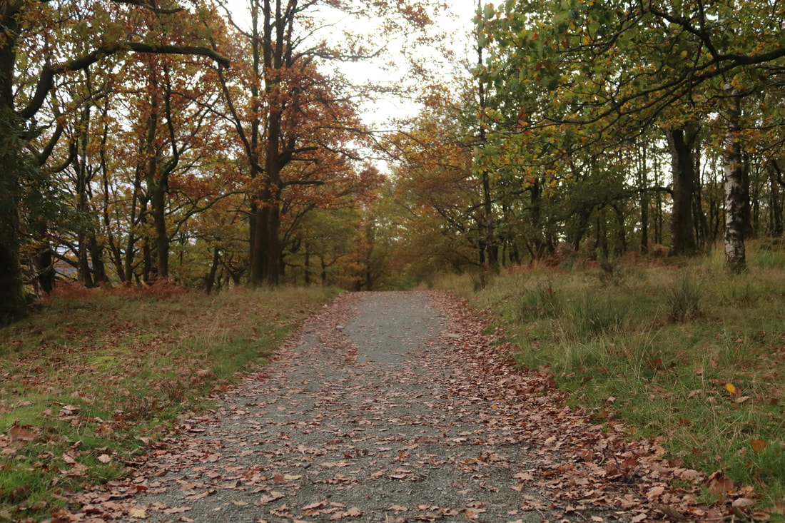
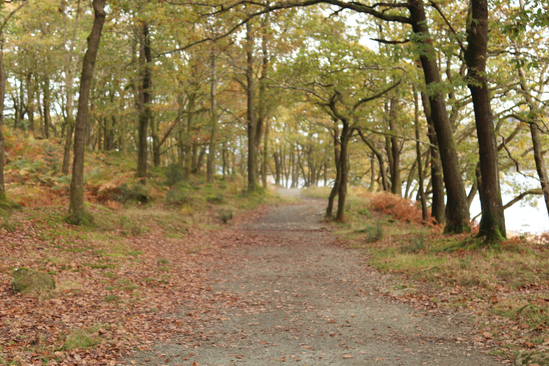
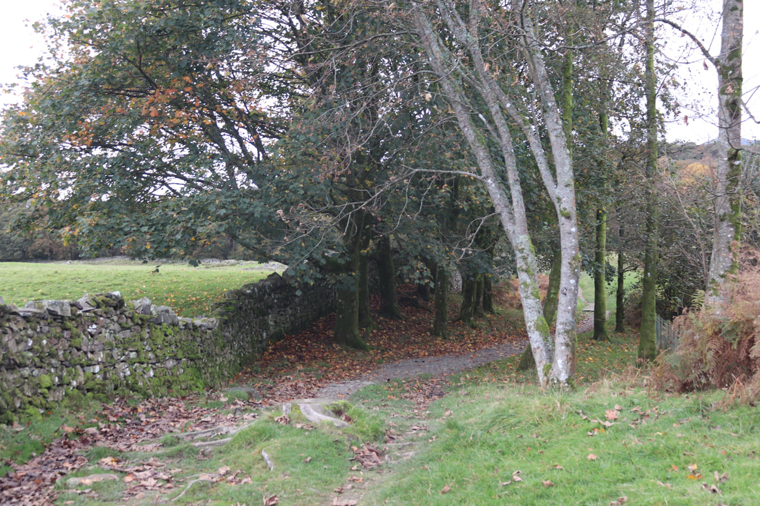
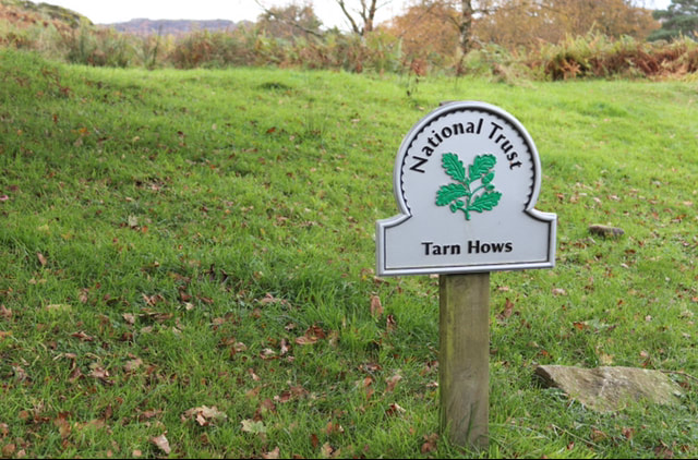
I have taken images of the lake district in Manchester in year 10 but I will also go out into my local community to capture local landscapes and do some studio or fantasy landscapes and textures.
During this project I will use many different techniques with the camera to develop my work to a higher standard. The camera techniques that I would like to use are: ISO, aperture, white balance, exposure triangle, rule of thirds and shutter speed to demonstrate that I have a better understanding of how to use a camera to achieve interesting and creative images without them being blurry and out of focus.
and photoshop to enhance my images so they are able to make them look professional and more visually pleasant.
I hope to use the following tools in photoshop: layers, spot healing, sharpness, saturation, blur, brush tools, lasso. I could also use some editing apps on my phone like snapseed. I will have to keep the camera on manual as I will be doing most photoshoots outside the lighting won’t be consistent.
I hope to learn more about the theme of landscape photography but also how to take my work on a journey to create a meaningful and personal project.
I see my final format of images in galleries e.g fantasy, trees, berries, water from my best photo shoots in this project to show that I am able to edit my work and make them look professional and also to try and achieve a good grade in my photography work.
I have chosen to study this theme because I find it really interesting and I can take so many different pictures to make my work unique and stand out, it also helps me to be able to explore and visit new places that I haven't been to before.
I am going to do a lot of different landscapes such as trees, waters, flowers, urban and my own local landscapes. I have chosen to do this because its gives a wide variety of creativity and techniques, its an area where I can go out to explore many themes and I can think outside the box and push myself out of my comfort zone.
In order to produce a successful, creative end product I need to do some in depth research around my chosen theme. I will create a coggle mind map to see what I actually want to take pictures of. Also I will go on the internet and do research into famous landscape photographers and take inspiration from them. The photographers I want to take inspo from are: Charlie Waite, Ansel Adams and Thomas.
I hope to explore a wide range of different options so that I can build up an intricate understanding. I also hope to take a variety of photo shoots to explore Landscapes which means I will travel to different places in school and outside of school so that I am able to capture the best images I can.
I have taken images of the lake district in Manchester in year 10 but I will also go out into my local community to capture local landscapes and do some studio or fantasy landscapes and textures.
During this project I will use many different techniques with the camera to develop my work to a higher standard. The camera techniques that I would like to use are: ISO, aperture, white balance, exposure triangle, rule of thirds and shutter speed to demonstrate that I have a better understanding of how to use a camera to achieve interesting and creative images without them being blurry and out of focus.
and photoshop to enhance my images so they are able to make them look professional and more visually pleasant.
I hope to use the following tools in photoshop: layers, spot healing, sharpness, saturation, blur, brush tools, lasso. I could also use some editing apps on my phone like snapseed. I will have to keep the camera on manual as I will be doing most photoshoots outside the lighting won’t be consistent.
I hope to learn more about the theme of landscape photography but also how to take my work on a journey to create a meaningful and personal project.
I see my final format of images in galleries e.g fantasy, trees, berries, water from my best photo shoots in this project to show that I am able to edit my work and make them look professional and also to try and achieve a good grade in my photography work.
Research

Context
Charlie Waite is an English landscape photographer noted for his "painterly" approach in using light and shade. Born in England, he worked in theatre and television for the first ten years of his professional life before moving to photography. He is noted for his square format images using a 6x6 Hasselblad.
Charlie Waite is an English landscape photographer noted for his "painterly" approach in using light and shade. Born in England, he worked in theatre and television for the first ten years of his professional life before moving to photography. He is noted for his square format images using a 6x6 Hasselblad.
Composition
The photo has been taken at a higher eye level, probably on top of a hill, this is very effective because it really makes us focus on the raised hills and the trees as the photographer has captured the majestic landscape.
In my opinion I think he has used a wide-angled lens and a deep depth of field because you can see fine detail in the distance. Therefore the aperture was probably on f29.
The image is very horizontal as the top third section is blue, in the middle third is a dark green and the last third is a yellow-green, this is a classic technique in paintings and photography composition.
The neutral blue misty sky in the top third acts as a backdrop but does not distract from the main attractions like the tree and hills. The bottom 2 thirds are very green. To frame the shot by captured the triangle like segments of the hills and the green grass. By doing this its successfully given the image depth and fully shows the details of the hills and slopes.
There is a clear use rule of thirds so that the tree on the left side and the little hill in the top right corner are in the ‘sweet spot’ purposely make us drawn to them.
I believe the Waite has used a tripod as it’s very straight and I can almost imagine standing there.
The ISO and white balance is most likely on auto as the lighting looks quite natural. The landscape is in crisp focus so the shutter speed must be quite high e.g 1/4000. It looks so natural that I don’t think the image has been changed or manipulated in photoshop at all.
Connection
Charlie Waite is an important photographer as he is a figurehead of the British Institute of photography and leading academic voice for landscape photography.
This landscape connects to my work as I am keeping most of the lightning natural and only will be manipulating imperfections in photoshop vivid. I will use a tutorial on Charlie Waite’s work in order to get a similar result. I will create a similar end image but incorporate my own style of photography possibly using photoshop. I will take inspiration from this as I really like the idea of the horizontal lines and the use of the ‘sweet spot’ and rule of thirds.

Context
Martin is one of the UK's leading photographers specialising in landscape photography and wildlife images of the English Lake District and Scotland. He has worked as a professional photographer since 2005 and is well known for his images and articles, which appear widely both on-line and in books, magazines, calendars and the UK photography press.
Martin is one of the UK's leading photographers specialising in landscape photography and wildlife images of the English Lake District and Scotland. He has worked as a professional photographer since 2005 and is well known for his images and articles, which appear widely both on-line and in books, magazines, calendars and the UK photography press.
Connect
My project is based on researching different landscapes and textures and so I am going to look at a range of different landscape photographers. The reason I have chosen to look at Martin Lawrence's work first is because he took photographs of the Lake District which is an area I have been to (plan to go to) and so will use his work to inspire my own photographs. Martin focuses on capturing the beauty of nature and also looks at composition to frame his images. I hope to do something similar when I go out on location. He also seems to try and capture different times of the day, different seasons and different light, this is something I hope to do with my own work. I am going to start my photography with looking at a landscape in Autumn to capture the golden light and the beautiful colours and so I am using Martin’s work to help me think about how to frame my shots. I will use the camera on manual settings so I have to keep checking or changing This is something that Martin will have to do when taking his photographs.
The importance of Martin Lawrences work is that it bodies the cultural perceptiveness of the lake district and places in Scotland. The images are used for advertisement and they capture a moment in time that we will be able to remember and admire.
Composition
I can see Martin has used strong leading lines on the water as its shown in a triangle shape this is very interesting and visually pleasing with the reflection as well. This technique draws the viewer's eye to the water in the image.
This photo very clearly follows the ‘rule of thirds’ as the top third is the clearly blue sky. The middle third is the tree and water and the bottom third is more water and the grass.
The reflection shows that it wasn't a windy day and the water was very still. The photographer has captured the reflection perfectly; the image becomes quite abstract.
In my opinion colours are very warm and gentle, therefore I think the image was taken in the evening as the lighting isn't harsh and it is a bit golden so it must have been taken at golden hour. I suspect the time of year this image was taken was in autumn as the trees are very orange. The impact is that the photographer has captured the image in its full natural colour. The orange very pleasantly contrasts with the cloudy, blue sky.
I believe the shutter speed was quite low as the water looks blended out. Martin has probably used a telescopic lens as everything is in sharp focus with a deep depth of field so the f stop was most likely f36. I believe this image was taken at eye level on a tripod as it's very straight. As I can almost imagine standing there.
The grass and the trees in the image play an important part in the composition and framing of the picture and they balance the picture out. There is a tree of centre in the photo in the water; this is the main attraction making all the viewers drawn to it.
Personally, I like this image as it looks very peaceful. calm and visually pleasing. It reminds me of when I went to the lake district and saw and captured all the beautiful landscapes and views. This inspires my own photography as I would like to take images like this one.

Sunrise over Haystacks, Buttermere by Martin Lawrence
Composition
Martin Lawrences work bodies the cultural perceptiveness of the lake district and places in Scotland. The images are used for advertisement and they capture a moment in time that we will be able to remember and admire.
This image follows the ‘rule of thirds’, the mountains are in the top third and the water in the two thirds, which fills the rest of the image. The impact of this is that it makes the water stand out with the reflection as it takes most of the picture frame. It also pushes the mountains further back and so creates a good depth of field.
I can see Martin has used strong leading lines from the gravel shoreline, mountains, trees running down the hill and the building in order to create strong composition. These strong diagonal lines lead to a central point or the vanishing point which is slightly off center by the house. This technique draws the viewer's eye to this part of the image and gives depth to the photograph.
The reflection shows that it wasn't a windy day and the water was very still. The photographer has captured the reflection perfectly; the image becomes quite abstract as the reflection makes the photograph ‘symmetrical’.
In my opinion colours are quite soft, therefore I think the image was taken in the evening as the lighting isn't harsh and it is a bit golden so it must have been taken at golden hour. I suspect the time of year this image was taken was in summer as the trees are very green. The impact is that the photographer has captured the image in its full natural colour. The green very pleasantly contrasts with the clear, blue sky.
There is another clear vanishing point created by the white house, the gravel shoreline and the line of trees running down the mountain on the right hand side in this photograph. which is behind the tree and goes between the mountains, this therefore gives the image some depth and pulls your eye into the center of the image.
Martin has probably used a telescopic lens as everything is in Sharp focus with a deep depth of field. The f stop was most likely f36. I believe this image was taken at eye level on a tripod as it's very straight. This makes me imagine that the photographer stood in the water in order to take the image. As a viewer, I can almost feel like I am standing there, looking at the view.
The trees in the image play an important part in the composition and framing of the picture and they balance the picture out. There is a large tree on the left side of the image on one on one third of the image. Here are 3 different scales of the trees that add different heights and depths to the image.
Personally, I like this image as it looks very peaceful. calm and visually pleasing. It reminds me of when I went to the lake district and saw and captured all the beautiful landscapes and views. This inspires my own photography as I would like to take images like this one.
Photography mock

Context
Daniel Coyle Photography was founded by leading head photographer Daniel Coyle over 8 years ago. Within that time Daniel Coyle Photography has become one of the most talked about wedding photographers by brides in New York City, the tri-state area and at destinations all over the world. Setting itself apart from other New York City wedding photographers, Daniel Coyle Photography has pioneered and developed its own style of wedding photography combining all the best aspects of photojournalism, editorial, and lifestyle photography. Daniel Coyle Photography will capture all the emotions, feelings, actions, details and events that make up your day in a very non-obtrusive, relaxed, creative and candid way. Our portrait sessions are fun and relaxed for the whole family, bridal party and the bride and groom alike. The studio documents only a limited number of wedding events in New York City and worldwide each year.
Daniel Coyle Photography was founded by leading head photographer Daniel Coyle over 8 years ago. Within that time Daniel Coyle Photography has become one of the most talked about wedding photographers by brides in New York City, the tri-state area and at destinations all over the world. Setting itself apart from other New York City wedding photographers, Daniel Coyle Photography has pioneered and developed its own style of wedding photography combining all the best aspects of photojournalism, editorial, and lifestyle photography. Daniel Coyle Photography will capture all the emotions, feelings, actions, details and events that make up your day in a very non-obtrusive, relaxed, creative and candid way. Our portrait sessions are fun and relaxed for the whole family, bridal party and the bride and groom alike. The studio documents only a limited number of wedding events in New York City and worldwide each year.
Composition
Lone tree, Buttermere
The composition in this image is very pleasantly and cleverly placed. The mountains/hills and the grass play an important part in the composition and framing of the picture and they balance the picture out. The middle third is mountains/hills; they are almost like silhouettes as they are fully blacked out. This massively helps the soft blend of the purple pink and yellow sunset stand out and become more eye catching in the top third. There is a strong leading line where the mountain/hills meet the water. The impact of this is it clearly shows were the water starts and the pleasant reflection of the sunset on the water. In the bottom third, the grass also plays the role as a silhouette; it helps the reflection of the sunset on the water contrast with it being blacked out. The ‘lone tree’ is in the sweet spot/a third from the left. Its has purposely been captured there to make it the main focal point.
I think that the f stop was quite low e.g 4.5 because even though the mountains are blacked out they are still slightly blurred this helps to further emphasise the tree and contrast against the blend of purple, pink and yellow in the sunset. The ISO was most likely on auto as the landscape looks very natural and not at all artificial. This highlights how the white balance was probably on cloudy/sunset as it would have helped the image to look the most natural. In my opinion the water looks quite blurred this suggests that it was moving so the shutter speed was a bit lower e.g 1/300. It also implies it wasn't a still day or still water. So the image was taken whilst the water was flowing.
The main colours in the landscape are purple, pink, yellow and black. These colours may have been slightly enhanced in photoshop but the impact of them makes the photo more imposing and dramatic. The area of yellow in the image may have been a little over exposed as that's where the sun would have been before it set, so the photographer may have had to lower the exposure in that area.
In my opinion the image was taken at eye level as it looks like the photographer was just standing there to capture the landscape. This creates the impact that we as viewers are standing there. Coyle most definitely used a tripod as the image is very straight. I can tell this by looking at how straight the strong leading line is where the water and mountains meet.
Connections
Personally, I like Daniel Coyle's work as his images are very visually relaxing and peaceful. It reminds me of when I went to the lake district and saw and captured all the beautiful landscapes and views. The use of colours are bold but they’re very nicely and cleverly blended out. His work links with mine as I am doing natural landscapes. This inspires my own photography as I would like to take some images with similar effect and impact to this one.
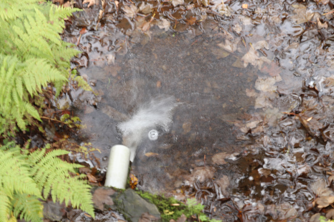
Plan
My starting point to take a set of photographs using my camera and phone camera is to capture many different textures. I will try to get a variety of different close-ups in different environments. I have been greatly inspired by my trip to the lake district. Where I focused on natural textures e.g trees, leaves. I have also done a mind map and mood board to display my ideas and have been researching many different photographers who capture landscapes.
The equipment I am going to use is my iphone camera and my canon camera. The reason why I am using two cameras is so I can extend my skills and techniques both in and outside of school. In my opinion this will allow me to use a broader range of lens based media.
For my sets of images I am going to take galleries of: shells, bark, trees, flowers, plants, grass, water, rocks, stones, feathers, leaves, buildings, objects, wood etc.
For the shoots I will do indoors and outdoors to expand the range of the environment of the photography.
By taking photos on my camera/iphone I hope to expand and take images that I can manipulate in photoshop and/or snapseed. By focusing on just texture and landscapes it will really help me make a meaningful and personal response.
Refining my work
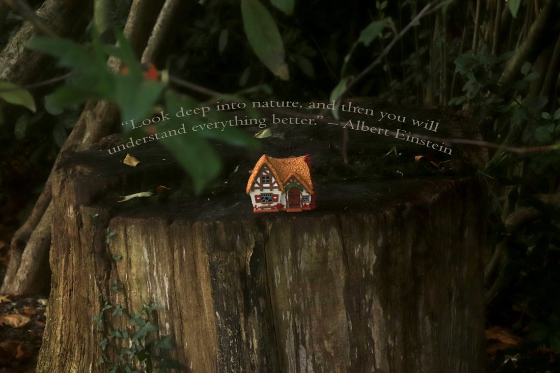
I am going to use my fantasy images to create a landscape in photoshop. The images from that shoot were successful as they were taken in the evening in autumn which was the right time of day in my opinion because the golden hour and the warm red, orange and brown leaves gave the images light up nicely and create a satisfying scene.
For inspiration, I will look at fantasy artists such as Wojciech Siudmak and Hiro Isono. These photographers use colour and composition effectively so that the images are visually pleasing because their choice of colours and skill in photoshop is highly effective.
For inspiration, I will look at fantasy artists such as Wojciech Siudmak and Hiro Isono. These photographers use colour and composition effectively so that the images are visually pleasing because their choice of colours and skill in photoshop is highly effective.
I will take inspiration from this by using tools such as levels, contrast, opacity, saturation and exposure that will make my work unique and meaningful. However I will only take bits of inspiration from them as I want it to fit into my idea of fantasy.
To create a unique, eye-catching landscape I will manipulate images in photoshop. To help me I am going to watch videos to enrich my knowledge on photoshop particularly on layers and how to add sparkles. This knowledge will greatly help me to develop my final outcomes to be the best they can be.
To create a unique, eye-catching landscape I will manipulate images in photoshop. To help me I am going to watch videos to enrich my knowledge on photoshop particularly on layers and how to add sparkles. This knowledge will greatly help me to develop my final outcomes to be the best they can be.
I want to stick with natural landscapes as I feel they fit in with fantasy more than man-made does. I also really like Natasha Watson’s fantasy shoot with the model so maybe for my next shoot I will take my camera out into my garden or the park where I can incorporate a model or have something levitating in my work
Fantasy


Best and worst:
The best image from the fantasy gallery is on the left as its in a sharp focus and the golden hour lighting pleasantly lights up the image and bounces off the glitter of the house. The worst image from the fantasy gallery is on the right as its too dark and slightly blurry to fix it I should make the ISO higher or put it in some sun and adjust the lens more.
Shells


Best and worst:
The best image from the shells gallery is on the left as its clear and the texture and colour of the shells is interesting and it very pleasantly contrasts with the black background. The worst image from the shells gallery is one the right as the smaller shell in the back is blurry therefore the image isn't as neat and clear. So to fix it I should just make the aperture higher and in my opinion it is just slightly over exposed so I should lower the ISO a bit.
Cactus


Best and worst:
The best image from the cactus gallery is on the left as the natural golden hour lighting is just right, it really shows the two shades of green and the textures of the cactus. The worst image from the cactus gallery is on the right as its way too dark therefore isn't clear and vibrant like the other one. To make it better I should just make the ISO higher.
Stone


Best and worst:
The best image from this stone gallery is on the left as it clearly shows all the textures and and details on the stone pleasantly and the use of the low aperture/shallow depth of field helps it stand out. The worst image from this stone gallery is on the right as it isn't as visually pleasing as the rest and is slightly blurry at the top to fix that I should refocus the lens and lower the aperture.
Leaves


Best and worst:

The best image from the leave gallery above is on the left as its in sharp focus and the lighting is just right that it is not overexposed or too dark The lamp and auto white balance really show its warm orange-yellow-pink colour. The worst image from the leave gallery above is on the right as I moved my hand so its blurred and very slightly overexposed in my opinion. I make it better I should keep my hand still or maybe use a tripod and lower the ISO a little bit.


Brick walls


Best and worst:
Best and worst:
The best image from the bricks gallery is on the left as its very full and really shows off the pleasant texture and also colour palette of brick red and brown. The worst image from the brick gallery is on the right, even though it shows texture and aperture it isn't as visually attractive as the others.
Stained glass


Developing my gallery of images to extend my outcomes:
I have taken images of a section of Urban landscapes. This is so I can compare and contrast this with my natural landscape images I've done. These images will allow me to expand my ideas to be more creative in photoshop/photopea.
I have taken images of a section of Urban landscapes. This is so I can compare and contrast this with my natural landscape images I've done. These images will allow me to expand my ideas to be more creative in photoshop/photopea.
Berries


Best and worst:
The best image from the gallery above is the one in the middle. This is because it in sharp and in focus the red berries have a bright red shine from the natural lighting from the sun. The the shallow depth of field very pleasantly makes the berries the main attraction. The worst image from the berries gallery is the one on the left as its unfocused and unclear to make it a lot better I should just refocus the lens until it is sharp.
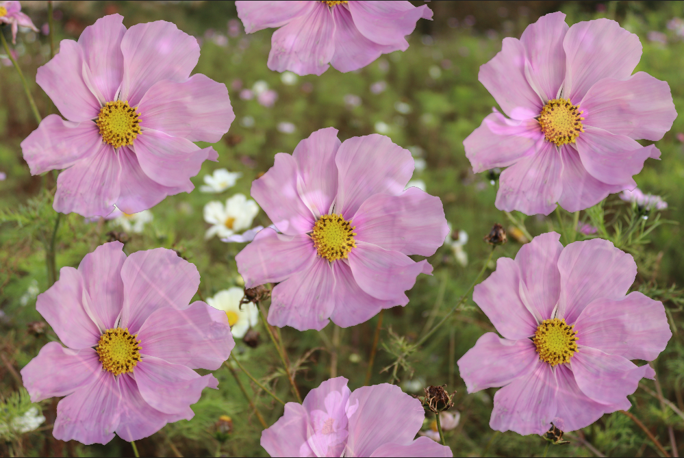
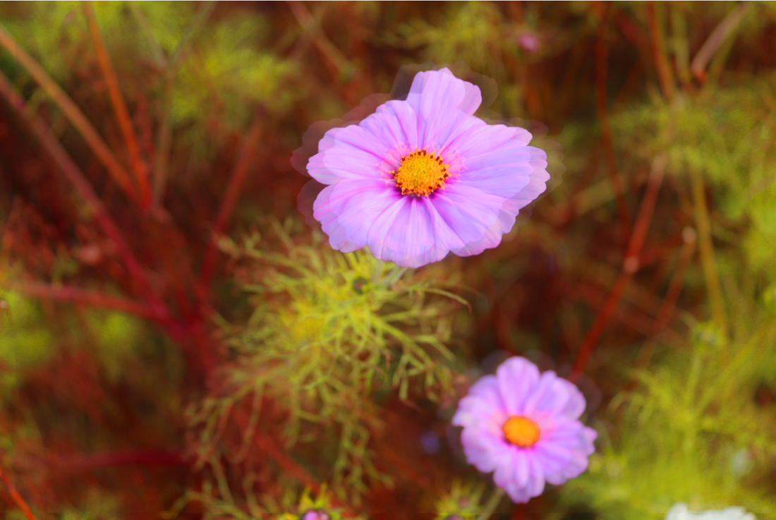
Flowers

Working with a professional photographer.


Best and worst:
The best image from the flower gallery is the on on the left as its sharp and in focus therefore more pleasing to look at. The aperture was very low and it follows rule of thirds. The worst image from the flower gallery is on the right as it is blurry and and flower is isn't in sharp focus. To improve it I should adjust the lens more until its sharp and maybe make the aperture higher.
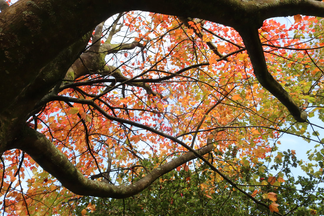
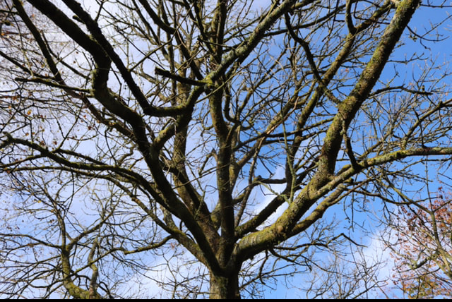
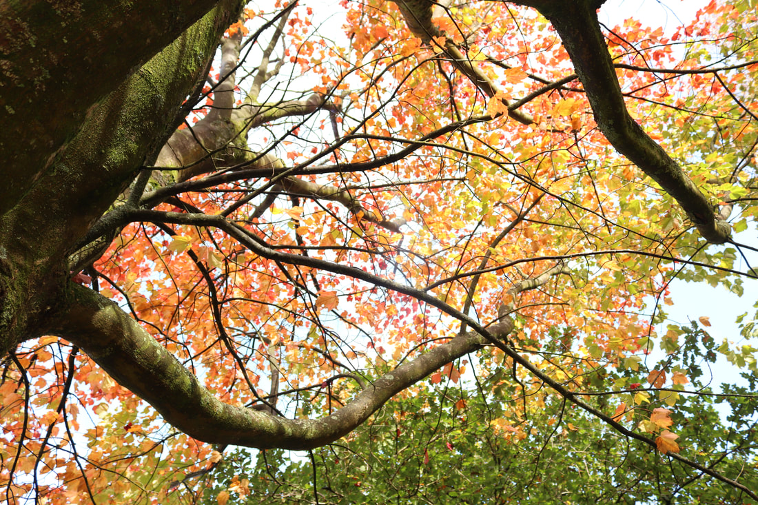
Trees

|
|

|


Best and worst:
Best and worst:
The best image from the tree gallery is one on the left as its in sharp focus and is clear. In my opinion the low aperture and shallow depth of field really makes the leaf pop and become the main attraction of the image. The worst image from the tree gallery is on the right as its blurry and unclear to make it a lot better I should adjust the lens until its in sharp focus.
Reflections


Best and worst:
Best and worst:
The best image from the reflection gallery is on the left as the reflection is clear and the image is in focus and bright. the boats almost follow rule of thirds. The worst image from the reflection gallery is on the right because you can barely see the reflection and the ISO was too low therefore the image is too dark. To improve it i should use a higher ISO and adjust the lens so its sharper in focus.
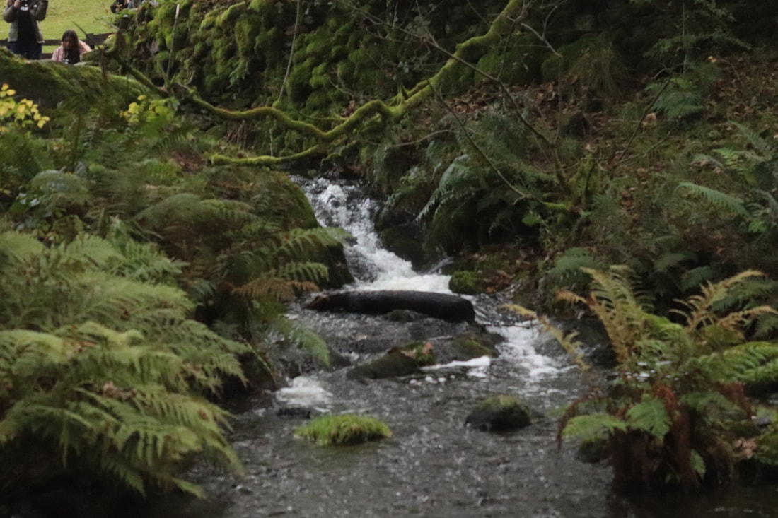
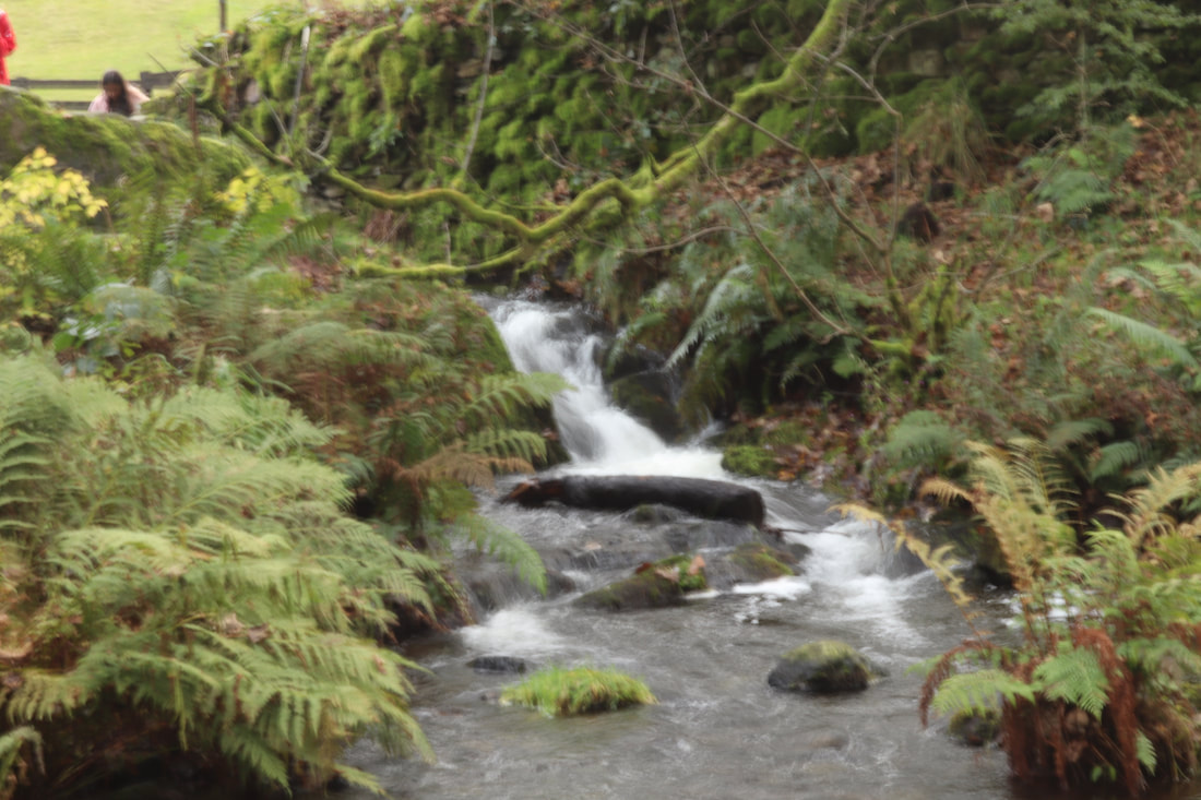
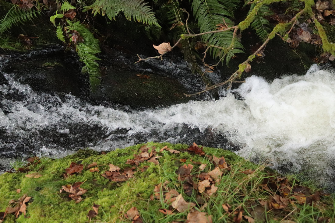
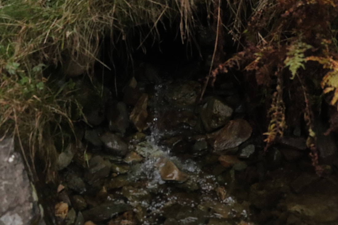
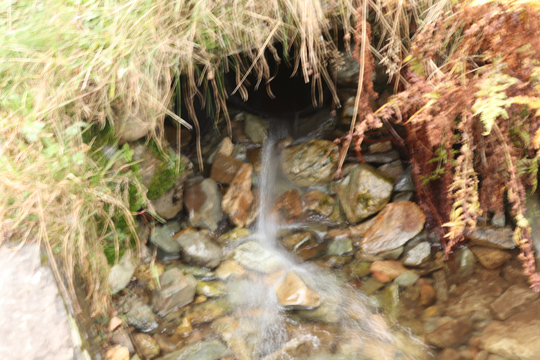
Water


Best and worst:
The best image from the water gallery is on the left as its crystal clear and visually pleasing. The sun and the reflection follows rule of thirds and is in the 'sweet spot'. Horizontally the birds and ducks also follow rule of thirds. The worst image from the water gallery is on the right as the sky is overexposed and it is slightly blurry. To make it a lot better I should refocus the lens and reduce the ISO.
In the water images below I experimented with shutter speed.
|
|

|
|
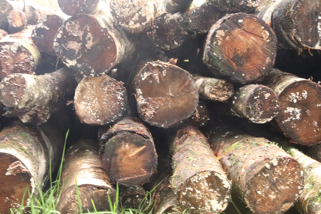
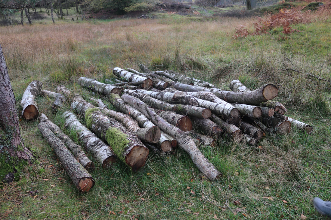
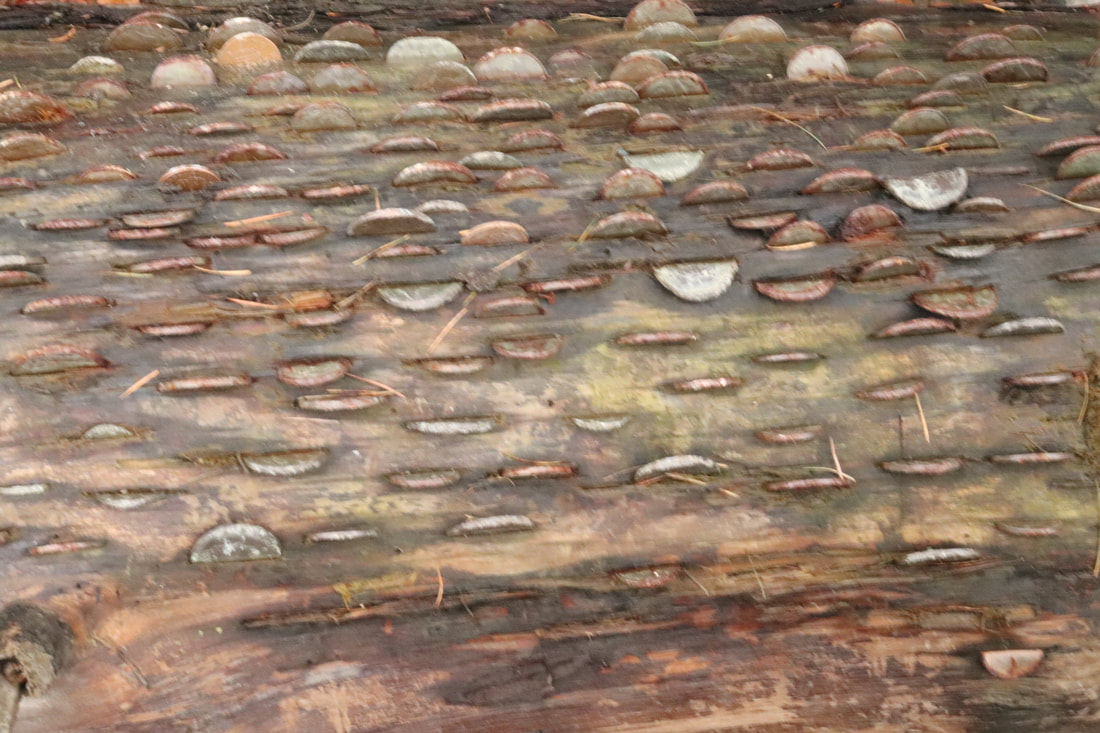
Wood


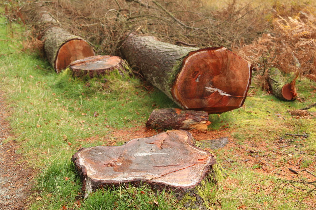
|

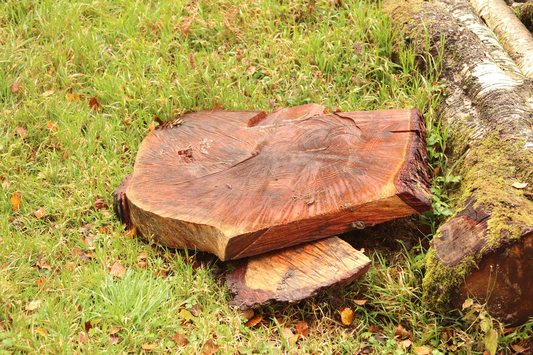
|
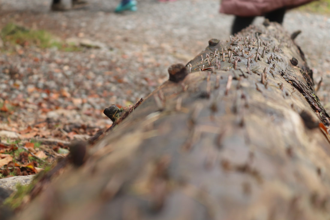
|
|
Best and worst:
|
|
|
The best image from the wood gallery is the one on the left because the white balance was sunny so it gives the wood a bright red-orange colour. Which I find visually pleasing. The image is in focus and sharp. The worst image from the wood gallery is the one on the right because unclear and isn't as appealing to look at. To make it better I could hold the camera still and stand further away.
Fog/mist


Best and worst:
The best image from the fog gallery is on the left as horizontally following rule of thirds. The bottom third is the green grass, the middle third is the trees and sheep and the top third is the misty, white sky. The worst image from the fog gallery is on the right as it uses the tungsten white balance making it look highly unnatural and unusual. To improve it I should put it on auto or cloudy white balance.
Close ups


Best and worst:
The best close up images are all the ones with the shallow depth of field/ the low aperture. (On the left side). This is because it makes the main object clear and in focus making us drawn to it. The images with the high f stop are the worst from the close up gallery because they aren't as pleasing to look at and we cant clearly see the main object in the foreground due to the busy background.
Snail


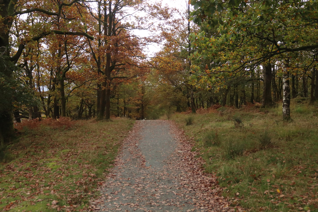
Pathways
|
|
|
|


Stone bricks


Extra images
|
|
|
Using photoshop and photopea
I have now taken all of my images now I am going to experiment with them in photoshop and photopea in order to get some successful outcomes.
The tools I am going to experiment with are: magic wand, layers, exposure, warp, filters, text and collage. Now when making my final outcomes I can use these tools in photoshop and photopea.
The tools I am going to experiment with are: magic wand, layers, exposure, warp, filters, text and collage. Now when making my final outcomes I can use these tools in photoshop and photopea.
Before photoshop:


After photoshop:

Before photoshop:


After photoshop:

Before photopea:


I have developed this image in photopea using the magic cut and copied and adjusted the layers to get an almost collage effect.
After photopea:
Before photopea:
Before photopea:


I have developed my image in photopea by adjusting the exposure saturation and contrast. I also copied the layer and adjusted the alignment of it to get the interesting blurred look.
After photopea:
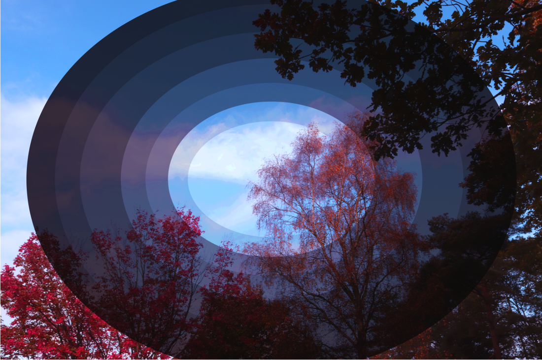
Before photopea:


I have developed my image in photopea by using the warp tool. I used the bulge warp filter and them adjusted the hue, saturation and lightness.
After photopea:

Before photopea:


I have developed these image in photopea by layering duplicates of it together and gradually changing the exposure every time to make this cicular image. I adjusted the saturation, brightness and and vibrance
After photopea:
Developing my ideas further
So far in my project I have used 2 pieces of software photoshop and photopea to edit my photos to been develop and refine them into a fantasy theme which I want to stick with this is, so the outcomes are at their best and look visually appealing. I have experimented developed in techniques such as magic wand, layers, exposure, warp, filters, text and collage. This has helped extend my knowledge and outcomes.
Personally, I enjoyed using the warp text and warp filters as I think they fitted in best with the fantasy theme and also the using the magic cut to create a pattern/ collage like image, These techniques demonstrate my understanding of the all the tools, layers, filters and options available in both photopea and photoshop.
The collage exposure circle image I didn't really like as they didn't fully it in with the theme or the image I picked was harder to do.
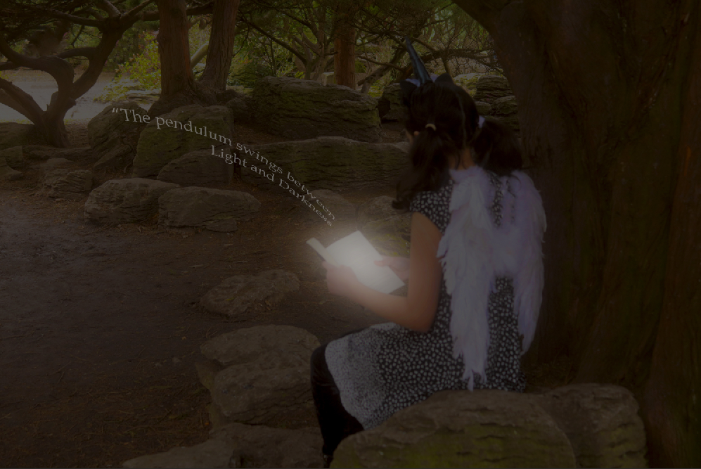
For my final set of images I plan to stick with the fantasy theme with the houses and I will add a model with wings to expand outcome on them and use more techniques and not just the layers and warp text.
As my landscape theme is fantasy I would like to make a fairytale like outcome. So I will print out the images and create a book to have a physical outcome.
I will use the tutorials below to help my outcomes, they are all fantasy and fairytale related.
Personally, I enjoyed using the warp text and warp filters as I think they fitted in best with the fantasy theme and also the using the magic cut to create a pattern/ collage like image, These techniques demonstrate my understanding of the all the tools, layers, filters and options available in both photopea and photoshop.
The collage exposure circle image I didn't really like as they didn't fully it in with the theme or the image I picked was harder to do.
For my final set of images I plan to stick with the fantasy theme with the houses and I will add a model with wings to expand outcome on them and use more techniques and not just the layers and warp text.
As my landscape theme is fantasy I would like to make a fairytale like outcome. So I will print out the images and create a book to have a physical outcome.
I will use the tutorials below to help my outcomes, they are all fantasy and fairytale related.
Mood board


Before photoshop:


I have developed this image in photoshop by using text and the warp tool. I added the text then used the warp filter arc to bend it. I then adjusted the saturation, exposure and lightness so the image wasnt too dark.
After photoshop:
Before photopea:


I have developed this image in photopea using text and the warp tool. I added the text then used the warp filter arc to bend it. I then adjusted the saturation, exposure and lightness so the image stood out.
After photopea:

Before photoshop:


I have developed this image in photoshop by adding exposure on the the picture on the book and distorting the picture on the book so it looks like a part of a page and then added text ad warpped it.
After photopea:

Before photoshop:


I have developed this image in photoshop by adding exposure in one area. I added the text then used the warp filter arc to bend it. I then adjusted the saturation, exposure and lightness so the image stood out.
After photoshop:
Before photoshop:


I have developed this image in photoshop by adding exposure on the book and wings. I added the text then used the warp filter arc to bend it. I then adjusted the saturation, exposure and lightness so the image stood out.
After photoshop:

Before photoshop:


To develop this image in photoshop I have added the exposure to make the book glow and adjusted other factors so it looks natural.
After photoshop:

Before photoshop:


To develop this image I used exposure on one area of to make it glow and layered the image. I also warped some text on top.
After photoshop:

Before photoshop:


To develop this image I used a picture off the internet and added the model in. I added bats and made them slightly glow and warped some text on top.
After photoshop:

Before photoshop:


To develop this image I used a picture off the internet and added the model in. I made the book glow by using exposure in one area and warped some text.
After photoshop:

Final images

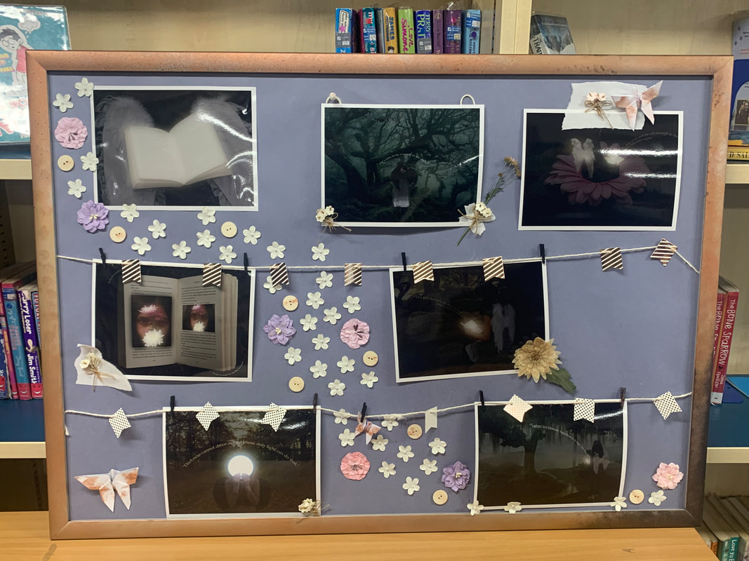
With my final images I planned to make a display for them by printing them out and pinning them on a foam board with flowers and leaves all around.
Mood board


The things I used are below


Final product

|
|


Evaluation
My theme for my project was natural fantasy landscapes. I was excited to interpret the theme in my own unique style. I enjoyed being able to different places to capture shots that are natural and celebrate nature such as the lake district, many parks and my back garden. The shoots I did in these locations allowed me to explore the beauty of each location as they all had different views. I was able to capture the beauty in my photographs, achieving this was difficult as it is all about the precision of what aperture, white balance, shutter speed, etc to use and be able to take the picture at the right moment.
Throughout my journey I have gained many skills and techniques that I previously had not had access to. The best skill is I have enhanced is Photoshop I knew how to do very basic things like add text or filters at the start. But now I learned to create an area of glow using exposure and warp the text. I also learned to make layers and duplicate shapes I have made and use other tools to make my images look more developed.
As this was a natural landscape project I encountered a few setbacks. Sometimes the weather wasn't appropriate to take pictures in and if it was it wasn't consistent enough. So I did have to edit lighting in photoshop on a few images. I always went out around the golden hour time so the lighting was almost always bright and vivid if there was no clouds.
The photographers I took inspiration from were Daniel Coyle and Martin Lawrence. They both take beautiful natural landscape images and cleverly place the composition and use the colours effectively. They also only enhanced the colours by a little in photoshop. I used a model in my work and used rule of thirds and the sweet spot like the Coyle and Lawrence does to create my outcomes.
In my opinion the most successful part of this project has to be my images after the use of Photoshop. I believe that my my photographs even before I photoshopped they were visually pleasing and to a high enough standard. I am happy of how my images came out as it showed me that I have learned much and been on an impressive journey with my skills, that has been shown through my work. I was pleased that I was able to produce outcomes as high of a standard and quality as Daniel Coyle and Martin Lawrence did.
